
CASE STUDY:
Creating a Multi-brand Atomic Design System Using Figma Variables

Introduction
As a UX Visual Designer at ICIS, I am the primary caretaker and expander of our Nova Design System, an atomically structured system of more than 300 components that powers all the interfaces our 20-person UX team design and our development team build.
ICIS is one of many companies under the umbrella of RELX, a FTSE-15 data and analytics company with over 35,000 employees across 40 countries. Each of the companies under the RELX umbrella has their own separate design system, UX team, and development squad. I led an exploration into the feasibility of harnessing Figma Variables to create a centralised design system to support multiple brands (or ideally, one day, all brands) under the RELX umbrella. We began simply, with just 3 basic components – buttons, checkboxes, and list items – from the ICIS and Cirium brands.
THE PROBLEM
How do you create a flexible, reusable, ‘1-1’ semantic layer to support two brands that developed separately with distinct visual languages and rules, while allowing the two brands to maintain their unique character and individuality?
The answer? Not easily.
THE RESEARCH
My team examined dozens of the most well known multibrand design systems. We found that usually, multibrand systems are developed together at the same time, which means they usually share visual language and design rules. Trying to unite two very different design systems as we were was far more rare, for reasons we were soon to discover.

Proposed
Structure
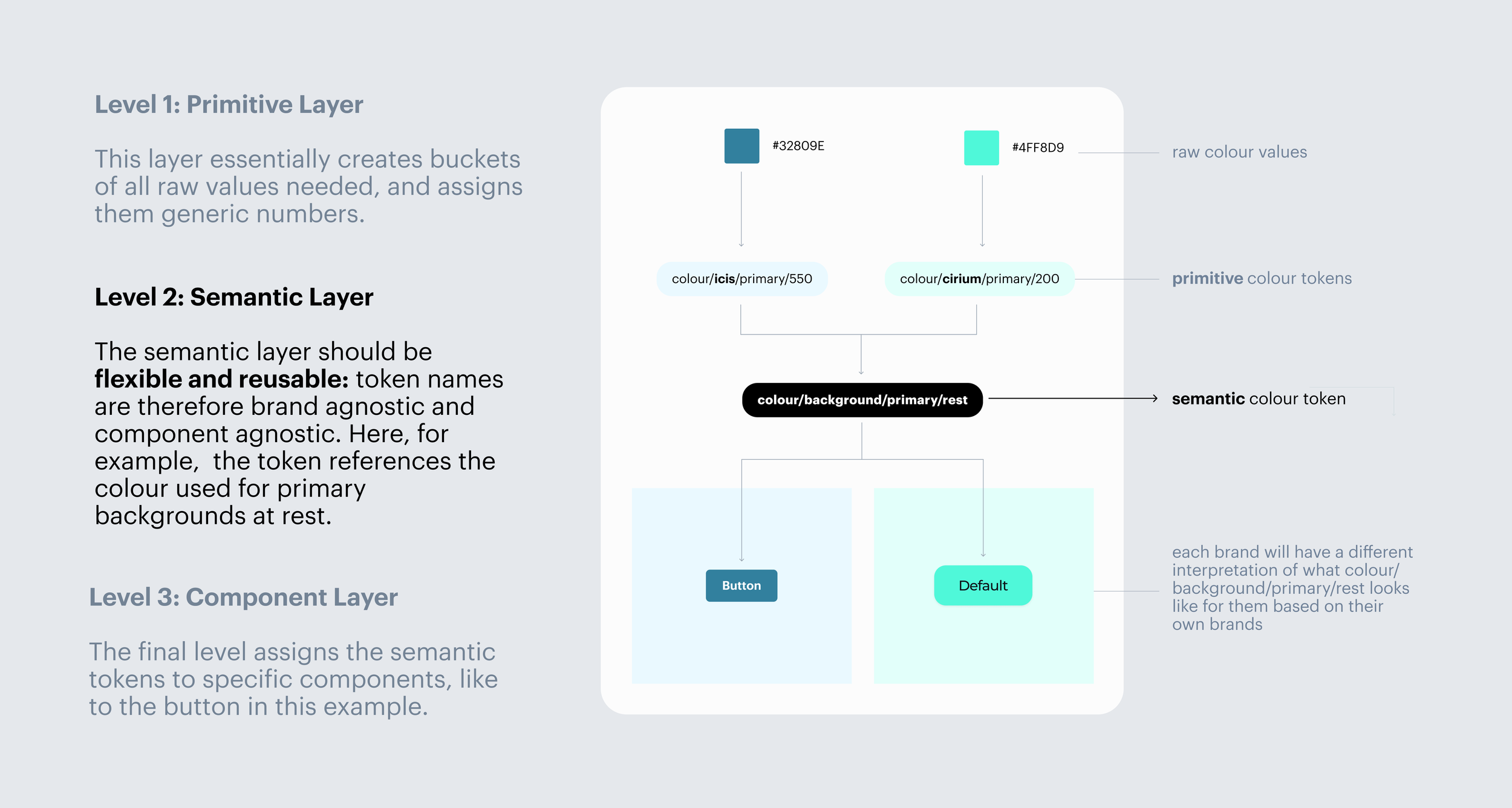
Based on our research, we devised a 3-tier token structure:
PRIMITIVE TOKENS

ICIS Colour Palettes, Left: Cirium, Right. You can see that already there are big inconsistencies in how many colours each brand has and what they might be used for within a design system.
We began by creating the primitive colour palettes. We took every colour in each the ICIS and Cirium systems as a base, and included 10 incrementally lighter tints and 10 incrementally darker shades, to give each brand a basic bucket of colours to work from, primitive tokens with an aligned naming convention, following the format ‘brand/colourname/100’ – the number reflecting the percentage of white or black over the base colour.
We followed this naming convention to create primitive tokens for typography and size.
SEMANTIC TOKENS
The semantic tokens proved the most difficult, as they had to find a way of handling lack of alignment and consistency both internally, within each system, and externally between both systems. Where a multibrand design system that was developed all together would use a ‘background/primary’ token in all the same places across both systems, when you are working with two brands that might use their primary colours in different places, you end up creating alternate palettes to accomodate inconsistancies that threaten to bloat and confuse the semantic layer, defeating its original purpose of being maximally flexible and reusable.
For example, one brand might use their primary colour sparingly, just as an accent, where another might use it everywhere along with a secondary and tertiary the first brand don’t use or have – how would you name those background palettes, and how would you reconcile them? I created a diagram to illustrate all the places where, in just 3 tokens, these inconsistencies threatened to de-rail the whole project.

POTENTIAL SOLUTIONS
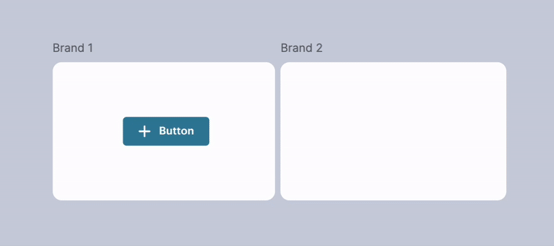
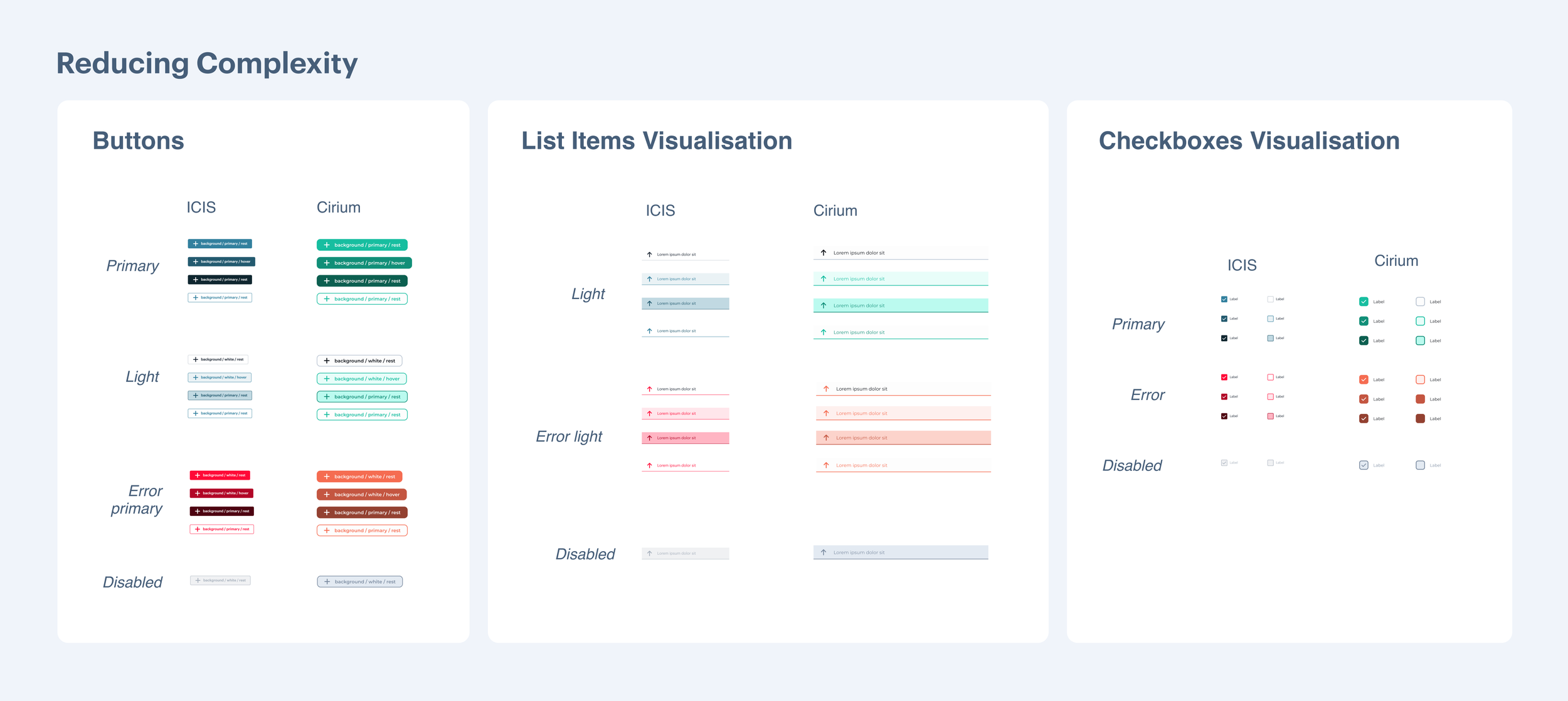
We set up three separate figma files with 3 separate variables sets, each set reflecting a different way of reconciling the complexities posed by lack of internal and external alignment. Within each file we built the buttons, checkboxes, and list items out of the variables, and for each way of working we were able to get them to switch seamlessly between brands:
MANAGING COMPLEXITY OR REDUCING COMPLEXITY?
We came to the conclusion that we would either have to find a way to manage the complexities caused by the lack of alignment between the two design systems, or we would have to reduce complexity by bringing alignment.
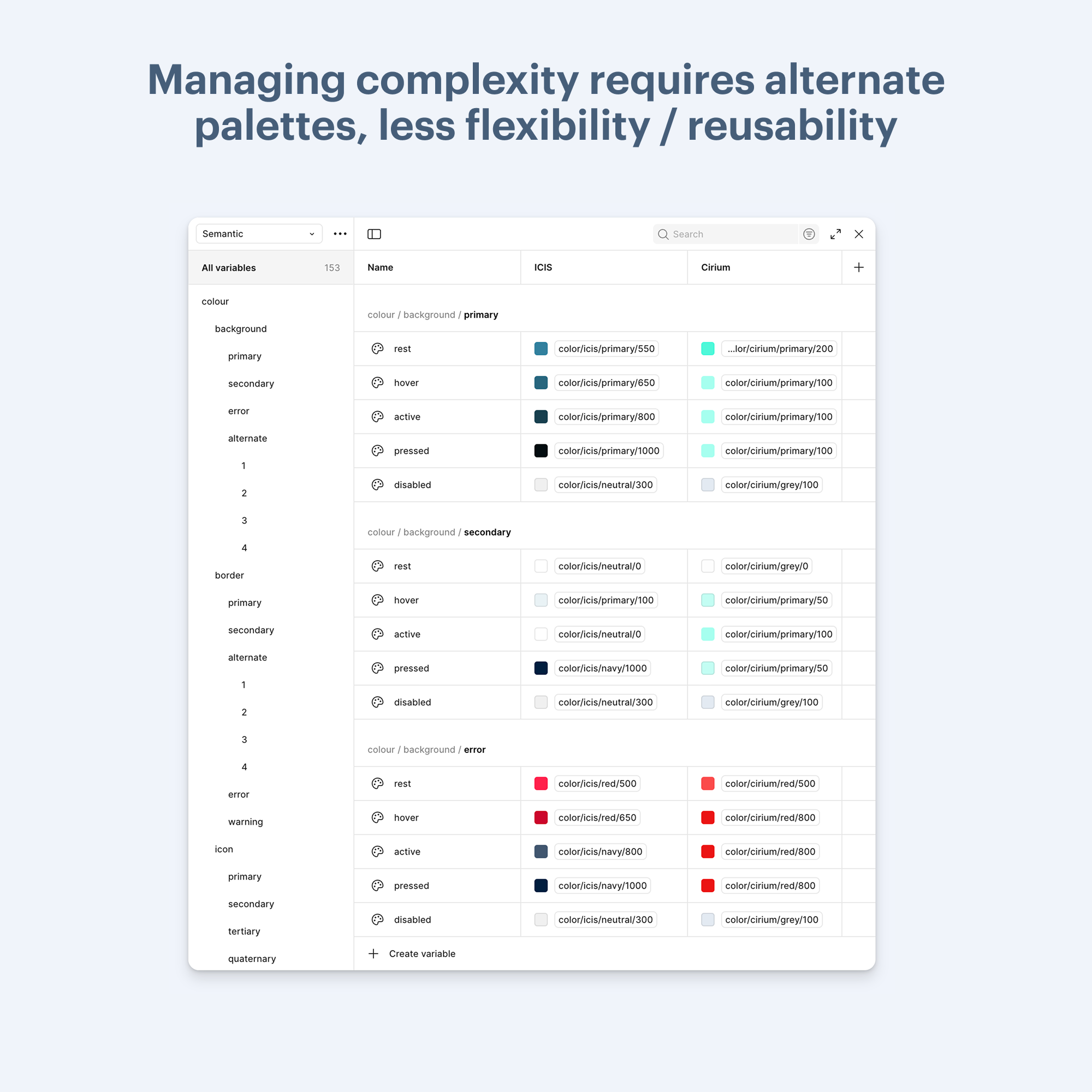
The variables panel for the ‘managing complexity’ solutions reveals all the alternate palettes we had to add to accommodate the inconsistencies. These palettes are intended for the specific components that break the alignment, and therefore are not as flexible or reusable as a true semantic layer aught to be.
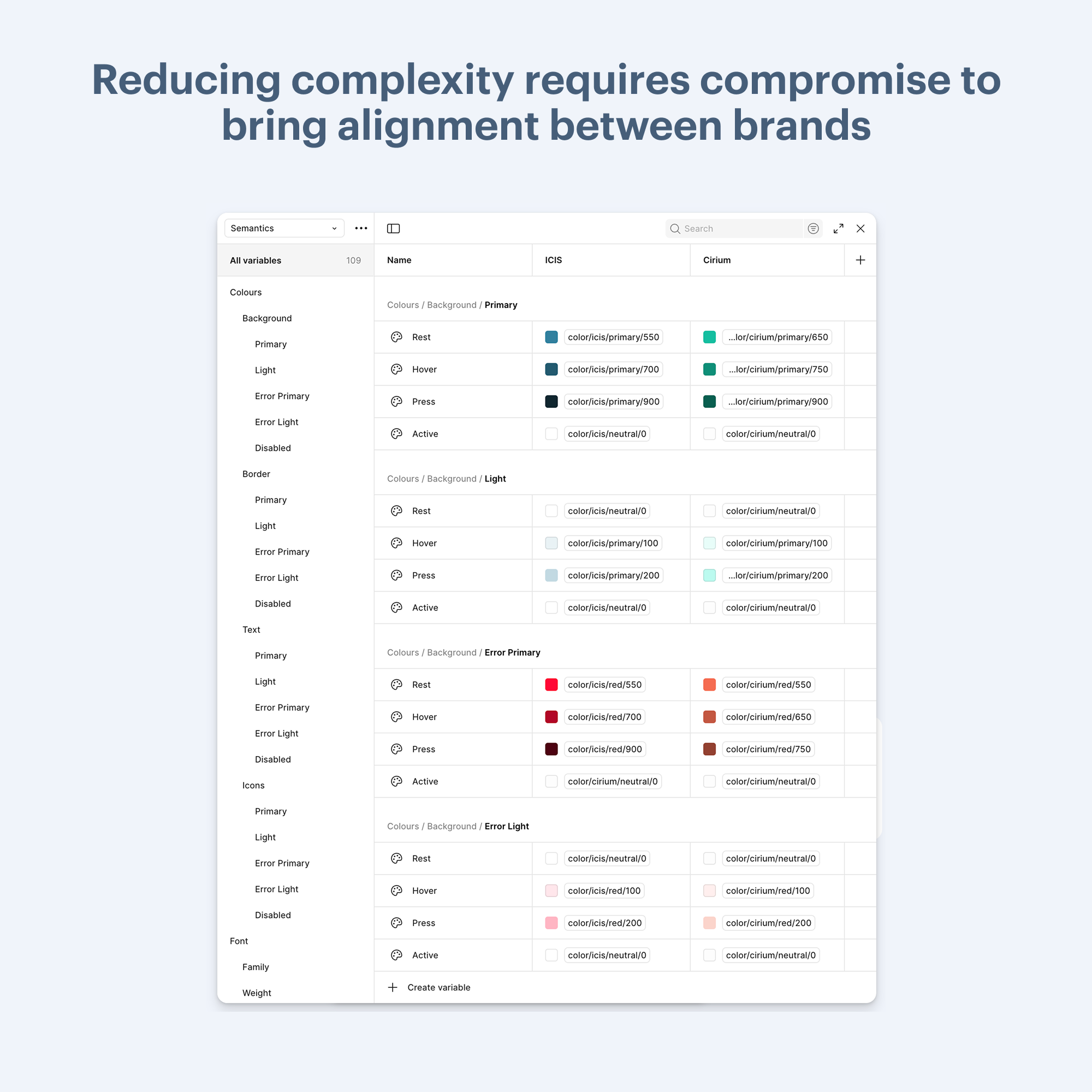
The variables panel for the ‘reducing complexity’ solution shows how the two systems might be made more consistent, while retaining their unique colour palettes and typography hierarchies.
Next steps
Now that we have our three possible solutions set up within variables panels in their respective files, we will be handing these options over to our development squads for a Hackathon that will determine the efficiency gains and pitfalls of each from the code side.